
We’ve all come across a landing page at some point in our internet browsing, and whilst we all see them fairly often, it is a lot more difficult to get it right than you might imagine. Here at Imperic Media we have made plenty landing pages and microsites and have seen what performs well and what doesn’t. Taking all this information we have put together this post about how to build a great landing page that converts.
Tailor the message to your ads
I’ve put this one first because I think it is without a doubt one of the most important points that can be made on landing pages. When creating a campaign, building just one landing page isn’t always enough! If you have multiple variations of ads across the web, or offline channels, you need to make sure that your landing page has content to match the ads. For example, if your ad says “Free ebook on building awesome landing pages”, and it directs through to a landing page that says “We can build you a website”, then to the person clicking the link, it feels as though they have landed in the wrong place.
Likewise, from a display perspective, if your landing page doesn’t have the same design aesthetic as the ads that brought a person to it, you could start to see your bounce rate rise and your signups disappear purely because the person arriving at the site doesn’t feel the consistency.
Lead with benefits, not features
Whilst this is a big point for a high converting landing page, it is also something you should apply to all your marketing. Everything I mention here can and should be applied to your core website pages too.
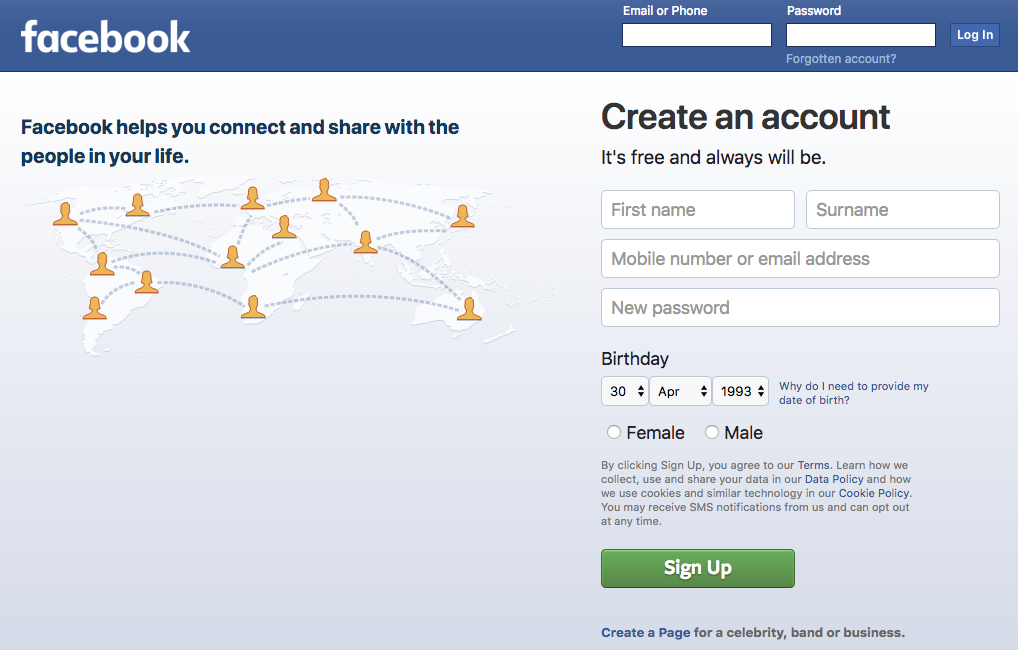
When you’re trying to hook someone in, listing out a ton of features your product/app/service provides is great, but people don’t engage with it. Instead, if you push the benefit that your product provides, suddenly people are far more likely to interact with your page or site because you have immediately identified how you are going to make their life easier. For example, if you look at Facebook, it would be very easy for them to list all the features of your account like “Create a full profile”, “Add photos and videos”, “Timeline of friends activities”, etc. Great! But not necessarily convincing. Instead, leading with “Facebook helps you connect and share with the people in your life”, suddenly you have pinpointed a fear or a pain point for people, and how you can solve it.
Don’t believe me? I’m not the only one who firmly believes this. You can read any number of articles on exactly this point. Here are just a few worth reading:
Features Tell, but Benefits Sell – http://www.helpscout.net/blog/benefits-sell/
Benefits Sell, Features Don’t, And Here is Why – http://www.smartpassiveincome.com/benefits-sell-features-dont-and-here-is-why/
CTA with good contrast
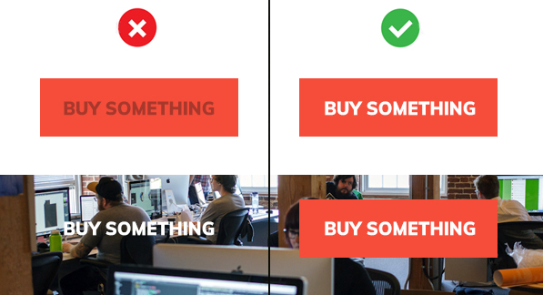
Making sure that the call to action is plain as day may seem obvious, but you’d be surprised how many landing pages fall short on this. Part of the problem? I think it’s down to the trend of using a giant hero image with text overlaid. Back in university we were always taught one rule which was “never run type over an uneven background”. This isn’t to say that you must stop using hero banners. Oh no. It is merely saying that you need to do something to make your call to action stand out from the rest of the page. The eye should naturally move through the page and land on the CTA without trying.
This is one area where A/B testing can be invaluable.
Remove the navigation
When you’re building a landing page, you have only one real objective. Whether this is is a signup or a download, you still know exactly what you want users to do on your landing page, so why would you give them a way out? This is exactly what you’re doing if you have navigation across the top of your page.
Definitely have a logo at the top, and allow this to link through to your main website, but if you have one objective, then giving people 5 options to click on is only reducing your ability to convert.
Don’t take more than you need
When it comes to asking people to hand over information, less is definitely more. You may have noticed how signup and registration forms are getting shorter and shorter (some sites have even stopped asking you to repeat your password twice, have you noticed that?).
Instead, always try and take the minimum possible information off people. Many studies have been conducted into this, and most seem to state that the your conversion increases by 3% for every form field you remove. For example, if you were looking to download an ebook, which one of the forms below would you think has the higher bounce rate?
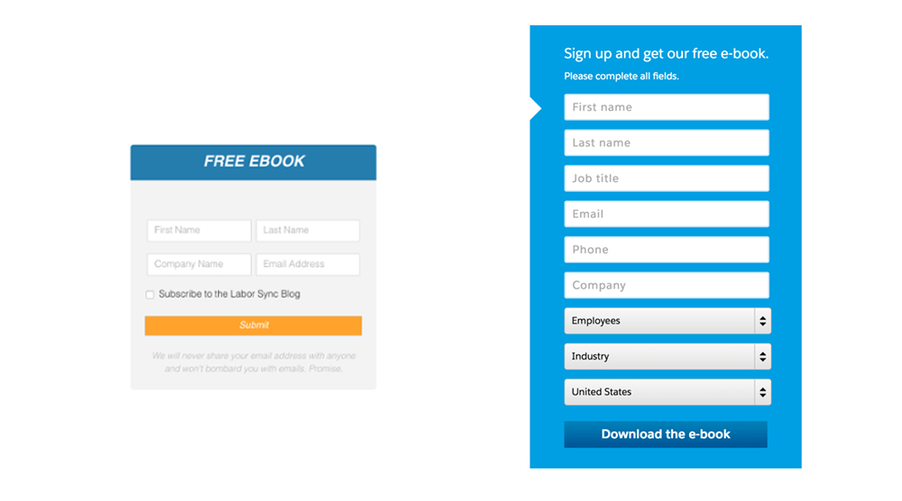
You’d be surprised just how powerful collecting only an email address can be, however it is important to note that your objective here is to find the balance between quantity vs quality.
Show some social confirmation and trust signals
This is important! Confirmation bias is a real thing and it has never been more important. The idea behind confirmation bias is that people are far more likely to buy something if they see that their friends, or someone else has purchased it before. This is why tools like Facebook and Twitter can be so important, and why everybody intently reads the reviews on Amazon before a purchase, or on tripadvisor before booking a hotel.
All this means that adding even one testimonial from a customer can increase conversions by up to 34%. Even better, a short quote from a couple customers and a clump of logos of companies who have made use of your services. This builds trust and should never be overlooked. On a landing page it can be even more important, because you don’t have all the page space you would have on your website to talk about how amazing you are.
Have a great thank you page
I know what you’re thinking, “But they’ve already given me their details, why does the thank you page matter?”. If we were looking at this from a purely factual, logical point of view, then yes, you’re right, but the problem is that human beings aren’t hardwired to think of everything from a logical/factual point of view.
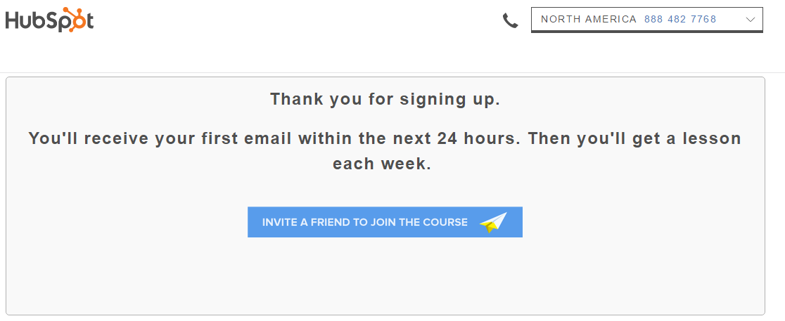
What you are doing is creating a user experience, because a great experience means that they are more likely to respond positively to your next interaction with them. Don’t forget that just because you have their details doesn’t mean that you have made the sale.
It is probably safe to assume that once you have their details there is still a lot that needs to be done to complete a sale. Make sure you lay out what the next steps you need the user to take are, in a nice simple manner.
Responsive is important
It’s important to remember that your landing page probably isn’t going to always be seen from a desktop or laptop, which is why you want to make sure your landing page looks great across all devices. The best way to do this is to use a responsive layout. If you are using tools like Wordress or Unbounce, then you will generally have this sort of functionality built in. It is important to ensure that your
If you are looking to an agency or a freelancer to build it, then make sure you mention this one up front so that you get the best possible experience for your users. These days any agency or freelancer who isn’t doing this as standard is one you should avoid.
A/B test, but not too much.
There is no doubt at all that you need to run A/B testing on your landing pages to ensure that you are always maximising your conversion. There are, however, a couple things to take into consideration.
Try not to A/B test more than one thing at a time. Why? Well let’s say you are testing the call to action text, but you are also testing a new headline. Suddenly conversions spike. Which one caused it? This is why we always suggest that you test only one element at a time to ensure you are getting the most accurate data.
Give it time! We generally see that unless you have a massively high traffic landing page, you should aim to run a test for a minimum of 14 days. This is to ensure you are getting the most accurate data possible. The idea being that if you have only 4 visitors, it’s quite easy to get a 50% conversion rate, but multiply that out to 4000 and suddenly your results become more relevant.
Tools for creating landing pages?
Custom build
The great thing about building landing pages is that you generally don’t need to have an extremely deep understanding of web development. With just a basic HTML/CSS understanding you should be able to put together a page fairly quickly. You can also speak to a web development agency to build you your landing pages, and you will generally find that because it is only a few individual pages, that you won’t need to pay as much for it.
WordPress
Everybody knows WordPress. A large chunk of the internet is powered by it, and its extremely easy to set up and use. There are, of course, more complex implementations you can use it for, but if a few quick landing pages are all you’re after then it can be done in a matter of minutes. If you’re looking for some landing page templates, you can find a bunch of free ones here:
Landing page platforms
For a monthly fee, it allows you to set up landing pages on your own domain, and with simple drag and drop interfaces, it means that you don’t need to get a developer involved to make new landing pages, and you can have your marketing team do them independently. A few of the more popular platforms we have used in the past are:
Unbounce
This is possibly one of the most common landing page platforms, and we have used it extensively for clients in the past.
Instapage
The cheapest of the 3 landing page builders, and one we’ve previously used as well. Definitely worth giving a try.
Leadpages
As with the other two, leadpages is another one of the popular platforms. It also allows you to integrate directly into WordPress which is a useful feature.
In fairness, most of these platforms all do roughly the same thing, and just comes down to individual interface preferences. Most come with a free trial, so it’s worth trying a couple and seeing what you prefer.
How to tell if a landing page is failing?
Apart from the obvious information of how many people are signing up, there are a number of other metrics you can look at. First off, never treat your landing pages differently from your site when it comes to tracking. Whatever analytics platform you use should be implemented on all your landing pages. That said, here’s what you should be looking out for:
Bounce rate – Your bounce rate is generally your first indicator that your landing pages aren’t working like they should. If you’re using Google Analytics, then to find out the bounce rate of your landing page, you simply need to head to Behaviour > Site Content > All Pages and once selected, you should see the bounce rate in a column. This metric shows the percentage of visitors that navigated away from the page without moving through to completion, and is a sign that people are finding your page a bit lackluster.

Conversion rate – If you have conversions set up in your adwords account, then you can get an almost instant picture of which pages are converting ( as well as which ads). If you don’t use Adwords, then you can set up goals within Google Analytics to get an idea of how much of your traffic is making it through the funnel. If you don’t want to set up goal funnels, you can simply add some event tracking to your CTA’s, which will give you the figures of the amount of times your CTA was clicked. You can compare this to your traffic and get an idea of the falloff. Not an ideal solution, but better than no data at all.
Hopefully you have found this guide to be useful, and we always love hearing tips from people, so please leave us your own great tips and advice in the comments!